With Windows 8 and Mac OS X Mountain Lion, Microsoft and Apple are both trying to bring features and concepts from their mobile operating systems to their desktop OSs.
But that's where the similarities end.
Let's take a closer look at each one, and try to get a better feel of the direction each OS is headed.
Getting Started
The Windows 8 Start screen.
The differences between Windows 8 and Mountain Lion are evident from the moment you log in. When you launch Windows 8, you see something completely different: Instead of the familiar Start menu, taskbar, and Windows Explorer, you get the Start screen, which consists of square and rectangular icons for your apps called Live Tiles (more on that later). Scrolling left and right lets you see more of your apps. Windows Explorer is still around if you want it, but you would be forgiven for thinking that it isn't.
By default the Start screen shows every app installed on your PC, but you can choose what does--and doesn't--appear there. And you aren't restricted to apps: You can pin other items to the Start screen, including bookmarks to your favorite websites and contacts from your address book.
Windows 8 will run traditional desktop-style Windows applications too, and it will do so in a desktop environment that resembles the layout of Windows 7. You'll probably spend a lot of time in the traditional desktop environment--especially before all your apps get Metro-fied.

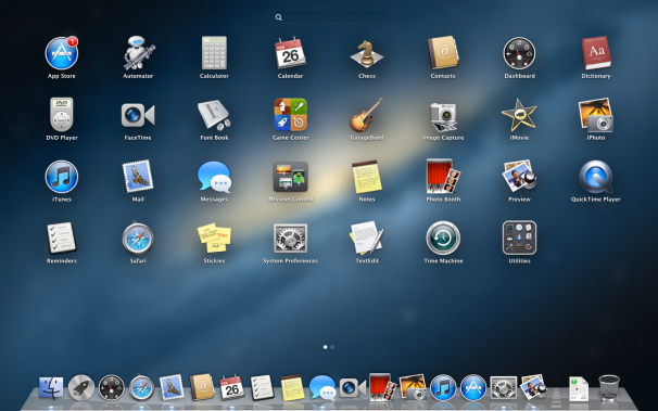
Launchpad in OS X
When you first log in to Mountain Lion, you'll see the typical OS X desktop--the menu bar at the top, the OS X Dock at the bottom, a cool space-themed photo for the desktop background. Clicking the Finder icon (the blue smiling icon) in the Dock brings up a Finder window for browsing files and folders. Mountain Lion does have a rough approximation of the Start screen: Launchpad. Within Launchpad you get an iPad-like grid of icons for your programs, which makes it easier to locate and access them. Despite Launchpad's iOS roots, however, Mountain Lion by and large looks and feels like a Mac, not an iPad.
Notifications and Live Tiles
The Windows 8 Start screen is more than an app launcher, thanks to Live Tiles. Though Live Tiles serve as app icons--clicking or tapping one will open that app--they also act as small informational widgets. The Bing Weather app's Live Tile, for instance, shows at-a-glance weather conditions, while the Live Tile for the game Cut The Rope shows your in-game status.
OS X has no feature that directly compares to Live Tiles, but it does include similar notification features. Dock icons can display numerical badges if an application wants your attention; for example, if you have three unread email messages, the Mail icon will display a '3' badge.
 New in Mountain Lion is Notification Center, a collection of notifications from various applications. You can view Notification Center from anywhere with a simple swipe
A notification alert in Mountain Lion
gesture, or by clicking an icon in the menu bar; when you call it up, your desktop slides over to reveal a list of notifications sorted by application. Programs can also display pop-up, banner-style notifications that appear in the upper-right corner. These banners float atop everything else on screen, and disappear after a few moments.
For its part, Windows 8 has pop-up notifications to supplement Live Tiles, and they behave much as Mountain Lion's do: They too appear in the upper-right corner and slide offscreen after a few moments.
App Markets Compared

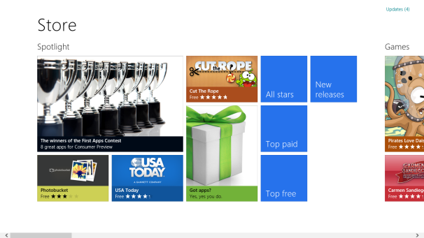
With Windows 8, Microsoft hops aboard the app-market bandwagon. Although it's still pretty spare, Microsoft's Windows Marketplace is generally attractive and well designed. From a functional standpoint, it's fairly similar to the Mac App Store: Apps are organized into categories, you can buy apps with one click, and you can read or post a user review for each app on the store. Although it's early, I can say that the Windows Marketplace has one distinct advantage over the Mac App Store: app trials. That's right--you can actually try an app for a limited period before you plunk down money for it. What a concept!
Gestures
Although we already have a clear idea of Mountain Lion's gesture support, we still don't know all of what we'll see in Windows 8. Mountain Lion lets you use trackpad gestures to perform a number of actions; for example, you can swipe up with three fingers to see all your open applications, or swipe left or right with three fingers to change desktops or to switch to full-screen programs. If you have Apple's touch-sensitive Magic Mouse, you can use some--but not all--of these gestures.
While Windows 8 has some gestures, at the moment they're all for tablets and touchscreen-equipped PCs. Swiping from the bottom and right edges of the screen with your finger brings up Charms, small toolbars that let you adjust settings or access additional features. Swiping from the left edge of the screen lets you switch between recently used apps.

For touchpad and mouse users, Windows 8 makes use of "hot corners" and right-clicking to bring up Charms: You position your mouse pointer in the lower right to bring up the Charms bar; place it in the lower left to return to the Start screen; mouse to the upper-left corner and then mouse down to see recently used apps; and right-click to bring up the app toolbar along the bottom of the screen.
We don't yet know what sorts of finger gestures Windows 8 will support for laptops. At this point it's all up in the air, but late last year Synaptics demonstrated a Windows 8-friendly touchpad driver that accepts various gestures.
File Management
With Mountain Lion, Apple does little to advance the Finder, OS X's file manager. It looks and works almost exactly as it does in Lion--if you're used to Windows Explorer or a previous version of Mac OS X, you won't take long to feel right at home with Mountain Lion's Finder.
Microsoft may be working hard to push the Metro interface, but any advanced file management still requires you to use the more traditional Windows Explorer. Fortunately, in Windows 8, Explorer gets an upgrade: It now features a Ribbon toolbar to make accessing commonly used features easier.
Switching between Metro and the traditional Windows Explorer is more than a little jarring and frustrating, so here's hoping that Microsoft does something to make managing files from Metro a little simpler. At the very least, I should be able to access my user account folder and flash drives or CDs without having to jump to Explorer. Maybe Microsoft wants you to use its SkyDrive online storage service instead? (More on that in a moment.)
What About Tablets?
One of Microsoft's main talking points for Windows 8 is that it makes "no compromises"--this one OS will run on your desktop, laptop, tablet, or touchscreen PC. This approach has some obvious advantages: For example, all of your applications will work across all of your hardware, and you won't have to relearn everything when you buy a new piece of equipment.
Just the same, this approach has some clear drawbacks too. For one thing, the learning curve for Windows 7 users can be more than a little difficult. Although the old desktop is still present, you have to work with Metro to some extent no matter what, since the Start screen replaces the traditional Start menu. And the reliance on hot corners for using Windows 8 with a touchpad or mouse takes quite a bit of getting used to.
On the other hand, Apple still sees Macs and iOS mobile devices as different beasts. Despite iOS's strong influence on its older sibling, OS X is still OS X. Apple's philosophy seems to be to allow the operating systems to be true to themselves, but to bring iOS features to the Mac wherever it makes sense to do so, and to make OS X seem familiar to iOS users. For example, although OS X is clearly different from iOS, many of the built-in apps have the same names across the two--the thinking seems to be, "Let's allow the Mac to be a Mac, but let's make iOS users feel right at home." Because of the differences, I think it's safe to say that reports of OS X's demise are greatly exaggerated.
Microsoft seems to regard the tablet as being an extension of the PC, whereas Apple sees it as a fresh break. That is, for Microsoft, tablets represent the next step in the PC's evolution, not a separate category. As a result, with Windows 8, Microsoft is trying to bring the same interface to all devices, rather than copying only certain elements from the tablet over to the PC.
And although you can turn off or ignore most of the iPad-influenced features present in Mountain Lion, with Windows 8 you really have no choice but to use Metro to some degree. It's a bit of a brain transplant, and if our recent survey is any indication, it has engendered some fierce opposition. For Microsoft's sake, here's hoping that the company can smooth out some of the kinks.
Source : www.pcworld.com
Source : www.pcworld.com


